The Painting Process - Issue Nº 8
In this series, I share the stories behind my paintings, my thought process, and the discoveries I make along the way.
※※※※
Painting SNOW
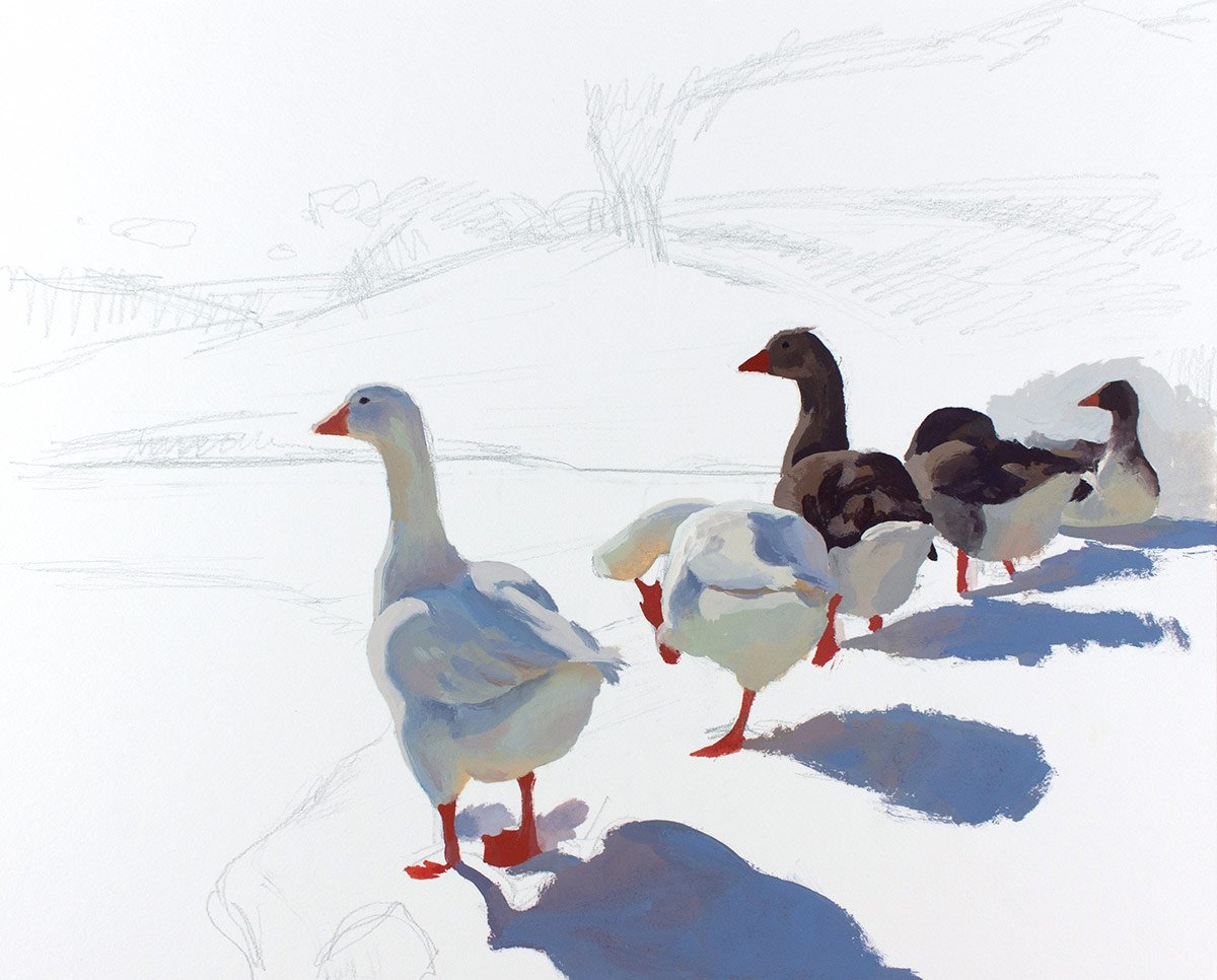
I started this painting last year at the end of winter. I painted the geese in a single session and then got distracted by other tasks. When I was ready to paint again, spring was in full bloom, and I didn’t feel like painting the snow anymore. But, there was another factor holding me back from working on this painting - fear. It was not the fear of failure but rather the fear of being challenged to find the correct values for each of the big shapes in this composition and make them work together.
In my reference photo, the sky was too dark because of the camera’s exposure compensation, so I had to fix that. The values in the sky needed to be harmonious with the value relationships between the other shapes in the painting. I knew the sky should be lighter, but how light should it be? Which blue should I use - the greenish cerulean blue or the slightly more reddish cobalt blue?

I also asked myself - How dark should the trees in the background be? How will I paint the snowy slope and the tree shadows on the snow? Should I include the sun in the painting? And many other questions. It was a bit intimidating. I realized this would be a challenging project and I made the decision to come back to this painting next winter when I would likely feel the inspiration to paint snow again.
A year passed, and when this winter arrived, I looked at my painting and thought, “I will have to finish this one before the winter ends.” (It had been standing unfinished on my studio table for a year!)
Every new painting brings challenges, and facing them makes us mentally stronger and more prepared professionally. This winter, I decided to paint as many snow paintings as I could because I knew if I faced these challenges, with time and practice, I would overcome my fear and master some new skills. If something in painting or drawing feels scary to you, instead of avoiding it, keep working on it until it’s not frightening anymore. So, this was what I did with snow this winter. I kept choosing subjects with snow until painting snow was not a problem.

I painted snow in different lighting conditions, with clear and overcast skies, at various times of the day, and I learned a lot.
I discovered that the colors of the snow in sunlight could range from very light neutral purples and pinks to subtle yellows and oranges. In the shadow, the snow could have all the rainbow colors: cast shadows could appear blue and purple; reflected lights could be green, pink, yellow, and orange.
Even though winter paintings can be colorful and filled with light, it’s crucial to remember that shadows on snow, no matter how bright, always have to be painted with neutralized colors. Pure blues can be used for painting the sky, but if you want to paint shadows on snow, the saturation of the blues in your palette has to be decreased by mixing them with a bit of orange or cadmium red.

Also, it’s important to avoid using pure white when painting snow. Pure white looks like a hole in a painting. When you need to make a bright highlight in a snowy landscape, mix titanium white with a speck of cadmium yellow or orange, and it will create an impression that the highlight reflects the warm sunlight. Pure white and black carry no color information; therefore, they must always be modified with warmer or cooler colors when used in representational art.
In winter, the sun is lower in the sky; therefore, it hits the land at an angle and makes the horizontal planes of a snowy landscape appear darker in value than the more vertical planes that face the sun directly, such as mountain slopes, the sides of snowdrifts, house walls, etc.

In the photo below, you can see how much darker the snow in the light is compared to the white surface of the illustration board. I reserved the lightest values for the highlights that would show the texture of the snow to add at the end. For the snow in the light, I used warm and cool grays.

After painting the land, I focused on the trees. I had to decide how dark they should be. They definitely shouldn’t have been as dark as they looked in the photo. They were background shapes, and I had to show the distance between them and the main subject (the geese) by making the trees slightly lighter and cooler in color. The darks on the brown geese were my darkest darks in this painting, so I made the trees a bit lighter, using a combination of warm grays and dark neutral purples.
You probably can see that the brown geese appear closer to us than the forest in the background because they are darker and more contrasting. That’s the power of values.

In the winter, the sky appears to be slightly greenish closer to the horizon, so I used cerulean blue mixed with white for the part of the sky where it met the distant hills, and then I switched to cobalt blue to paint the upper areas.
While painting, I tried to preserve the abstract patterns of the shadows on the snow and the simplicity of the forest in the background. I deliberately tried to make this painting a bit stylized so that it looked more like an illustration of a story than a realistic piece.

In this image, the painting is already finished. I painted the water quickly, carefully analyzing its values and comparing them with the values of the surrounding shapes.
There is a rule for painting reflections in the water: dark objects become lighter and light-value objects become darker. Notice how much darker the snowy hill's reflection looks compared to the actual hill. It’s the same for the sky. The dark forest line on the left, on the contrary, looks lighter in the water.
When I finished the water, I only needed to add some highlights to the snow. They immediately made the snow look more realistic, and all the abstract shadow shapes started making sense.
While painting, I constantly looked at my work in a small mirror, and the moment the painting seemed finished in the mirror, I put down my brush and called this piece finished. It’s easy to overwork a painting when adding details, but the mirror doesn’t care much about details. It shows the work as a whole, and when a painting appears to be finished in the mirror, I usually stop working on it. Not always, but most of the time.
When this painting dried completely, I covered it with varnish. In the photo below, it’s already varnished.

Gouache on Strathmore Mixed Media board, 8x10 in.
So, this was my adventure with this snowy geese painting.
Have a great day!
Lena.
P.S. If you enjoyed this article you might also enjoy my free E-Books and painting guides that can be downloaded here: https://www.lenarivo.com/free-guides
Download my free 30-page PDF, “Everything you Need To Know About Gouache”
In this 30-page PDF you will learn:
How to decide which colors you need when you start with gouache and how you can expand your palette to make it even more effective.
What kind of storage palettes to use with gouache to prevent your beautiful colors from fast drying.
Why you need to use two whites with gouache.
How to choose the right paper and what kinds of brushes work best with gouache.
About the setup that I like using for plein air painting with gouache.
You will also be provided with many useful tips that will make your painting experience smoother.