The Painting Process - Issue Nº 12

In this series, I share the stories behind my paintings, my thought process, and the discoveries I make along the way.
※※※※
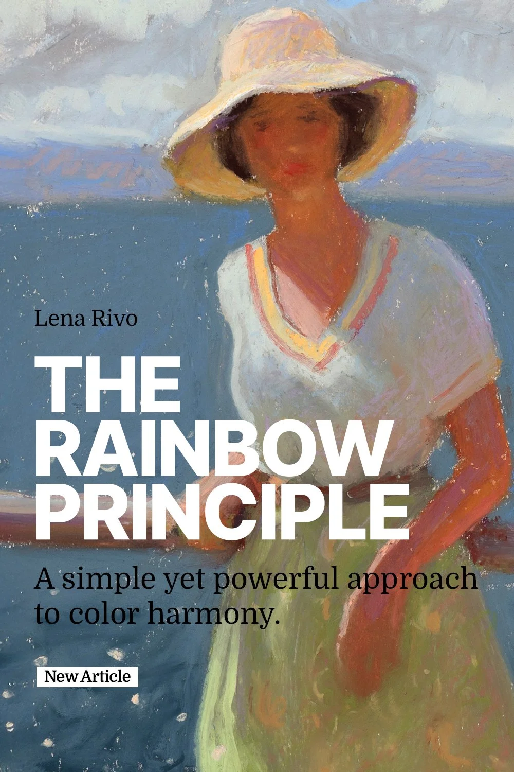
THE Rainbow Principle
In this article, I want to share a rule I use to make my paintings more harmonious. I developed it after countless attempts to achieve color harmony in paintings that felt too cool or too warm or had an overall color cast—appearing too bluish or too greenish. Sometimes, you do everything right, yet something still feels off, and you can’t quite pinpoint why. I’ve found myself in this situation many times and eventually came up with a simple rule that improves any painting: every painting should include all the colors of the visible spectrum, whether in muted or saturated versions.
I apply this rule to every medium I use and every subject I paint. I call it the Rainbow Principle.
Over the years of painting different subjects with different mediums, I’ve noticed that when a painting includes all the colors of the rainbow—even as subtle, muted tones—it always feels more harmonious. This approach brings a sense of life and balance to the artwork.
The painting below is a good example of this rule in action. I deliberately incorporated all the colors of the rainbow to create a sense of vitality and cheerful energy. In this composition, you can see the light blue of the sky, the purple of the distant mountains, the greenish blue (indigo) of the sea, the orange in the shadows of the figures and the cliff, the green in the water and the skirt of one figure, the light red of another figure’s skirt, and the yellow of the hat and the sand beneath the shallow water. I also repeated all these colors in every shadow, placing purples, yellows, blues, and oranges side by side to create a vibrant, harmonious effect.

I did the same thing in this painting of a family on the beach. Try covering the woman’s green swimsuit with your finger—you’ll immediately notice how the piece appears too warm without that blue-green balancing the warm hues. If you cover the baby’s yellow swimsuit, the painting will lose its vibrancy. This demonstrates how incorporating all the colors of the rainbow brings a sense of vitality to a painting.

When I begin to paint, my primary focus is on getting the color-value relationships of the main shapes in the composition right. Once I’ve completed my initial block-ins, I start searching for subtleties, such as reflected lights in the shadows and variations in color temperature within the light shapes. As I get closer to finishing the work, I check if my painting includes all the colors of the rainbow.
It’s not uncommon to find that one or two spectrum colors are missing in your painting, and when that happens, I look for ways to incorporate them. For example, the dominant color in most seascapes is blue. The sky reflects in the water, making it blue, and the cool atmosphere often turns distant mountains blue as well. This creates a very cool-toned scene that may lack warm colors. To break the monotony of the blue, I often add purple to the water and mountains. To make the water more dynamic, I incorporate yellow, orange, and green tones where it meets the sandy beach. For the sand, I add subtle pinks and purples to make its color more interesting.
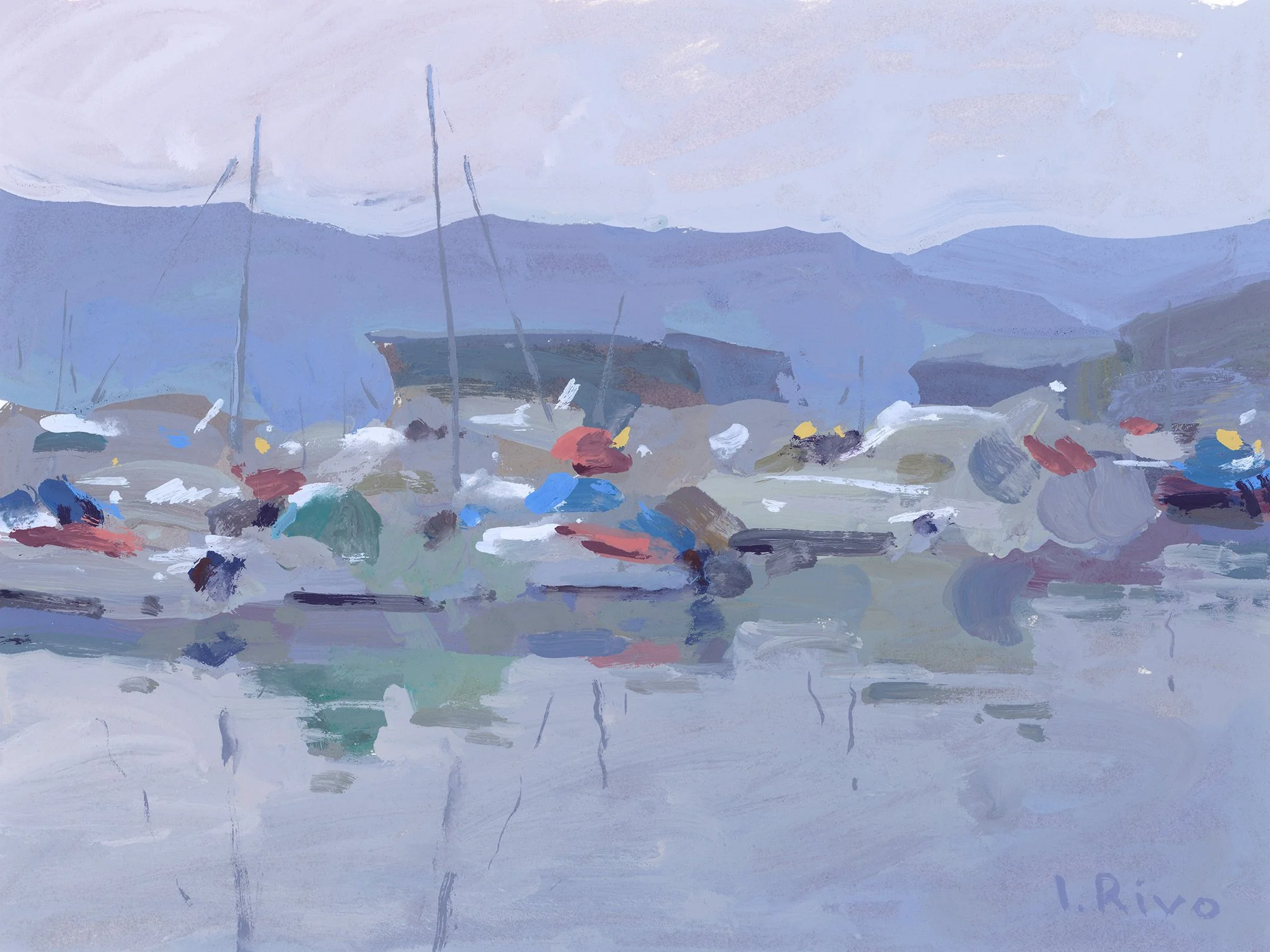
When a painting needs red or yellow, I look for man-made objects such as buoys or boats. Adding red, yellow, or orange buoys transforms the painting, as these colorful dots bring a sense of life to the scene. And because buoys are so easy to paint, I often add them to my paintings, even if they aren’t present in the actual scene.

Without those colorful accents on the boats, the painting below would look too cold and lacking vitality. By adding just a few colorful dots and greenish reflections I made it more alive. I didn’t made those things up; I looked for them after finishing the main block-ins because I knew I needed to add warm colors to the piece to make it more harmonious.
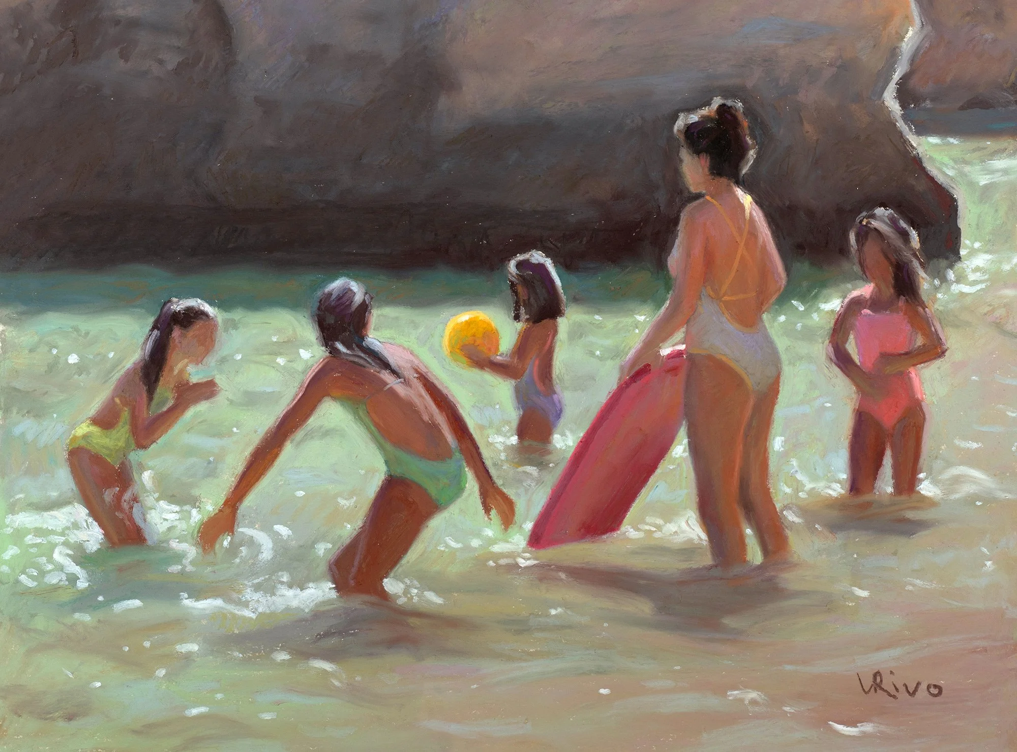
If there are people in the painting, I use their clothing to add pure, vibrant colors. At the final stage of painting, when I add details, I use this opportunity to “decorate” the painting and make it more visually engaging. Although prettiness isn’t my primary goal, adding a few small color accents injects energy and joy into the painting.

When I feel the painting won’t benefit from pure color accents, I incorporate the rainbow colors in their subtle, muted versions. For example, I might add a grayish purple to the clouds, a reddish brown to the shadow of a tree, yellowish, greenish, and bluish reflected lights to a house wall or a touch of muted orange on the roof tiles.
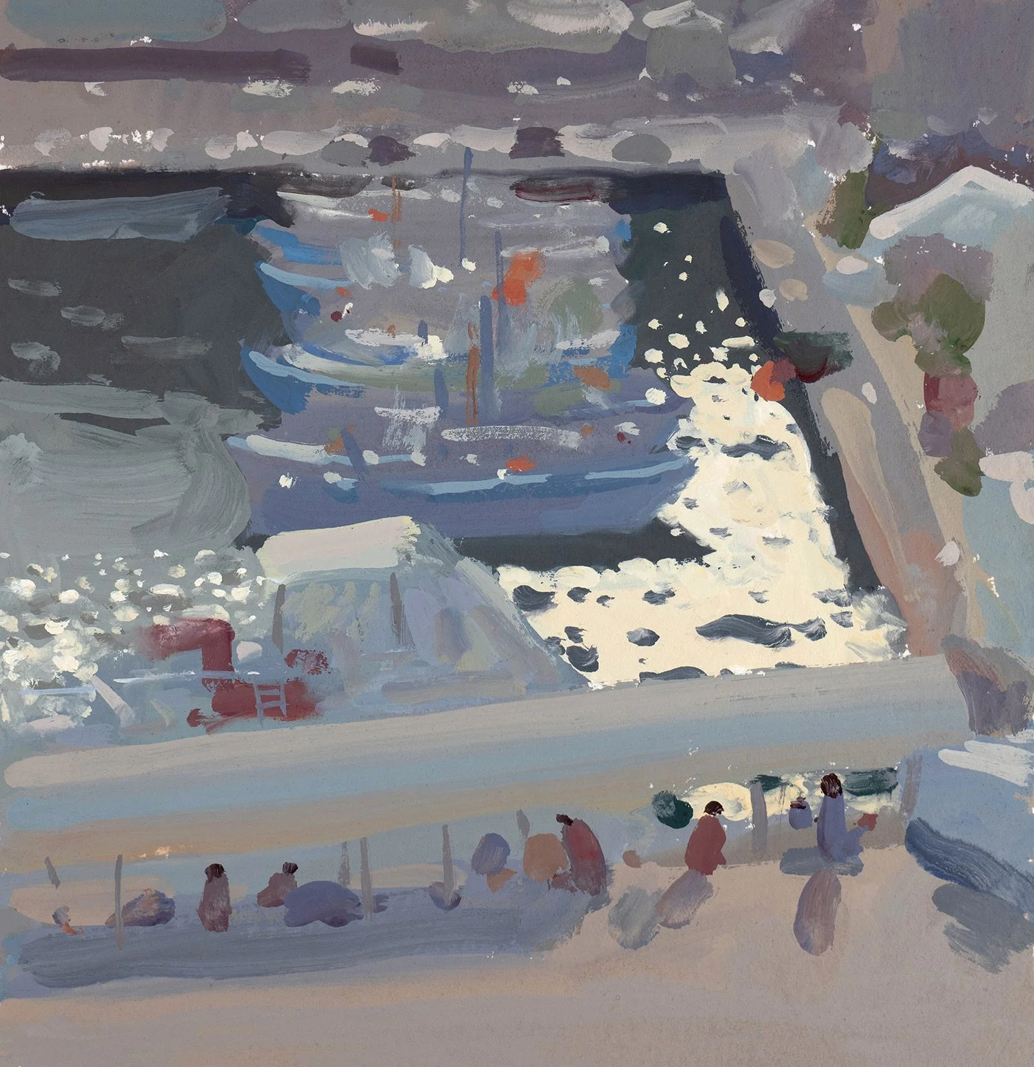
The scene captured in the next painting didn’t have any pure colors because everything was veiled in the morning haze, and most objects were in shadow. Yet, I was still able to include all the colors of the visible spectrum by using subtle, grayish versions of them. You can see yellow in the shimmering water, orange in the sunlit ground, blue and purple in the shadows, red in the people’s clothing and on some of the boats, and green in the water and the plants on the right.
Nature is the best teacher—I didn’t invent these color combinations; I observed them while painting from life. Achieving color harmony in a painting becomes much easier when you know what to look for in your subject. Of course, value is the most crucial aspect of painting, but once you’ve established the correct value structure, you can start looking for subtleties. If you try to find all the colors of the visible spectrum—even in their most delicate forms—and incorporate them into your painting, you’ll see how much more alive it becomes.
Even scenes that seem to lack color, have all the rainbow colors in them. They are subtle, not saturated, but they still can be observed because that's how nature works.
In this painting, we see white baby bears on white snow with blue shadows. But it’s not that simple. To bring the painting to life, I once again made sure to include all the colors of the rainbow—an essential step in making it look realistic.
Notice how the blue shadows in the snow are filled with warm reflected light. I used muted reds, greens, and purples to add warmth to the shadows. The same applies to the bears’ shadows, where I incorporated subtle yellows, oranges, and pinks to capture the reflected light. As the yellows blended with the blues, soft greens emerged, completing the full spectrum of visible colors.

Even when all the colors in my painting are muted, if every rainbow color is present, the painting feels more harmonious and alive. It is this subtle interplay of colors that brings life to the work and makes it feel complete.
Happy painting!
Lena
Download my free 30-page PDF, “Everything you Need To Know About Gouache”
In this 30-page PDF you will learn:
How to decide which colors you need when you start with gouache and how you can expand your palette to make it even more effective.
What kind of storage palettes to use with gouache to prevent your beautiful colors from fast drying.
Why you need to use two whites with gouache.
How to choose the right paper and what kinds of brushes work best with gouache.
About the setup that I like using for plein air painting with gouache.
You will also be provided with many useful tips that will make your painting experience smoother.